If you've ever stared at a monitor's spec sheet and felt your eyes glaze over at "DCI-P3" and "sRGB," you're not alone. These acronyms cause genuine confusion, and that confusion has real consequences: oversaturated icons, washed-out movies, and photos that look perfect on your screen but terrible everywhere else.Here's the truth: neither color space is inherently better. The one that's right for you depends entirely on what you're doing. Get it right, and your display sings. Get it wrong, and everything looks a little off.
DCI-P3 vs. sRGB: The Key Differences Explained
| Feature | sRGB | DCI-P3 |
|---|---|---|
| Color volume | Standard | ~25% wider |
| Primary use | Web, office, SDR content | Cinema, HDR, premium streaming |
| HDR support | No | Yes |
| Risk of misuse | Low | Oversaturation on SDR content |
| Typical coverage | 100% on most displays | 90–110% on wide-gamut displays |
Color Range and Vibrancy
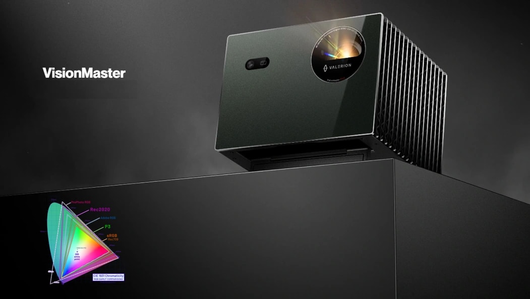
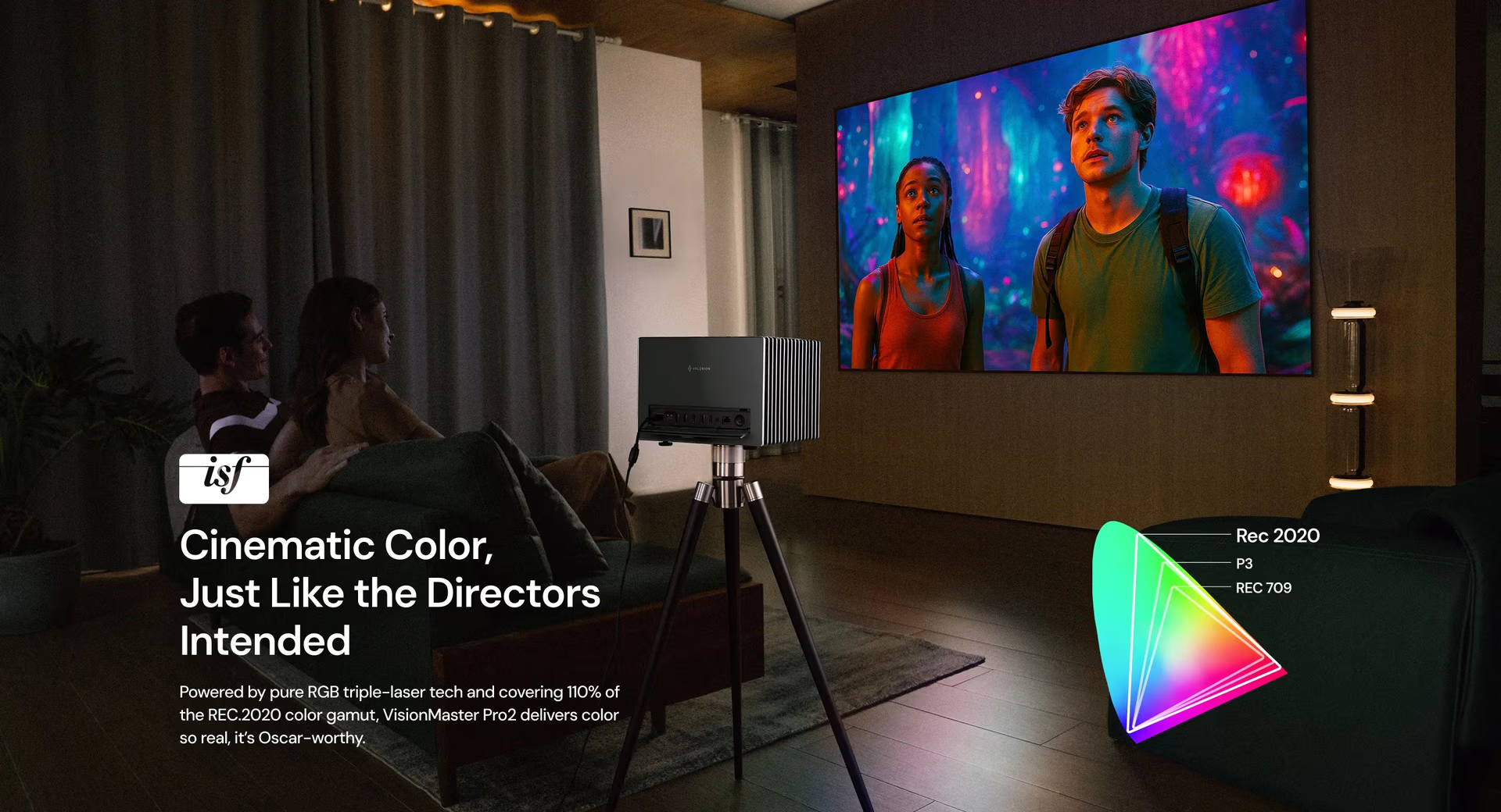
Think of color gamuts like boxes of crayons. sRGB gives you 64 colors, which is more than enough to draw most things accurately. DCI-P3 gives you roughly 80, adding deeper reds, richer greens, and more vivid cyans that sRGB simply cannot physically produce. That 25% wider spectrum isn't a marketing number; it's a measurable difference in how many colors a display can render, plotted on the CIE 1931 chromaticity diagram.For home theater enthusiasts who want to go even further, projectors like the Valerion VisionMaster Max push beyond DCI-P3, covering 110% of the even larger Rec. 2020 color space, the emerging standard for professional mastering that makes DCI-P3 look modest by comparison. For most users, though, DCI-P3 represents the current sweet spot between cinema-grade color and practical consumer hardware.
High Dynamic Range (HDR) Compatibility
sRGB is a Standard Dynamic Range (SDR) color space. It was never designed for HDR, and it cannot support it. DCI-P3, on the other hand, is the foundational wide gamut that modern HDR pipelines are built around. If you're watching HDR content on an sRGB display, you won't see HDR. Rather, you're seeing a tone-mapped approximation of it.This matters enormously in practice. When comparing HDR vs. SDR, it becomes clear that true HDR relies on both an extended brightness range and a wide color gamut working together, rather than brightness alone. A display that covers DCI-P3 and supports HDR can render the full intent of modern content. One locked to sRGB cannot, regardless of how many "HDR" badges appear in its marketing.
Which Color Space Should You Use?
For Home Theater and Movies
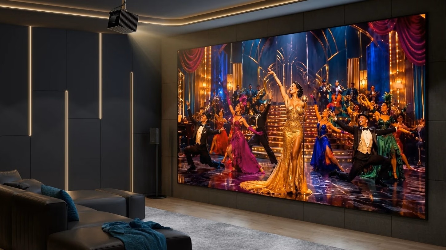
Use DCI-P3 or higher, if your hardware supports it. Modern 4K Blu-rays, Netflix's premium tier, Disney+, and Apple TV+ all master their content in wide color gamuts. Watching those titles on a display set to sRGB mode is like listening to a remastered album through a mono speaker: technically functional, genuinely diminished. Enable your display's DCI-P3 or "Cinema" mode and let the content breathe.
For Gaming
The answer here splits by era. Modern, HDR-enabled games are mastered in wide color gamuts and will look spectacular in DCI-P3. Older SDR titles, however, were built around sRGB. Playing them in DCI-P3 mode without proper color management stretches the sRGB signal across a wider canvas, producing that neon look where grass is radioactive green and character skin tones look sunburned. The fix is simple: switch to sRGB mode for older titles, DCI-P3 for modern HDR ones. Many gaming monitors now include per-profile presets to make this a one-button toggle.
For Photo and Video Editing
This depends on your audience. If your photos are headed to Instagram, a website, or any standard digital platform, edit and export in sRGB. Virtually every phone display and browser assumes sRGB, so using a wider gamut will cause your carefully color-graded images to look oversaturated on most viewers' screens.If you're mastering content for streaming platforms, digital cinema, or high-end print workflows, DCI-P3 is the appropriate target; just ensure your editing software has proper color management enabled so what you see on your wide-gamut monitor accurately represents the output.
For Everyday Web Browsing and Office Work
Use sRGB, firmly and without exception. Operating systems, browsers, productivity apps, and the entire web infrastructure were designed around the sRGB standard. Force DCI-P3 onto your desktop environment, and red logos become magenta, corporate blue buttons start glowing, and everything carries a slight uncanny quality. This isn't a hardware flaw but a color management mismatch. Your OS is sending sRGB signals and your display is stretching them across a wider gamut, inflating every color beyond its intended value.
Deep Dive: Understanding Color Spaces and Gamuts
What Exactly is a Color Gamut?
A color gamut is the specific subset of visible colors that a device can reproduce or that a standard defines. The full range of colors the human eye can perceive is mapped on the CIE 1931 color space chromaticity diagram — the horseshoe-shaped graph you've likely seen in display specs. Every color standard (sRGB, DCI-P3, Rec. 2020) is represented as a triangle plotted on that horseshoe. Larger triangle, larger gamut, more colors. A display's coverage percentage tells you how much of a given triangle its panel can actually reproduce.
sRGB: The Universal Standard
sRGB was developed in 1996 by HP and Microsoft as a common color language for monitors, printers, and the early internet. According to the sRGB specification, it was designed to match the capabilities of CRT monitors of that era and to ensure consistent color reproduction across devices without requiring complex color management. That design choice made sRGB extraordinarily durable. Thirty years later, it remains the baseline assumption for virtually all consumer digital content. Its longevity is a feature, not a limitation: a color space that every device understands is enormously valuable for communication and compatibility.
DCI-P3: The Cinematic Standard
DCI-P3 was created by the Digital Cinema Initiatives, a consortium of major Hollywood studios, to standardize color reproduction across commercial movie theaters. Introduced in the mid-2000s, it was purpose-built for cinema: richer reds, deeper greens, and a palette sized to match the emotional ambition of film. Over the past decade, as display technology matured, DCI-P3 migrated from projection booths into high-end consumer monitors, OLED televisions, and premium projectors, bringing theatrical color into the home for the first time at scale.
Conclusion
DCI-P3 offers a larger, richer color palette purpose-built for cinema and HDR content. sRGB is the universal standard that underpins the web, productivity software, and SDR content. Neither is any lesser than the other; using the wrong one for your context is. Match your color space to your content, and your display will finally show you exactly what creators intended.
Frequently Asked Questions
Is 95% DCI-P3 better than 100% sRGB?
Yes, in terms of color volume. Because DCI-P3 is a significantly larger standard than sRGB, 95% of it still contains more total colors than 100% of sRGB. Think of it as 95% of a large box versus 100% of a smaller one; the larger box wins even incomplete.
Why does DCI-P3 look oversaturated on my screen?
You're likely viewing sRGB content on a DCI-P3 display without a color management layer translating between them. The display takes an sRGB signal and stretches it across a wider gamut, inflating every color value. The fix is either enabling an sRGB emulation mode in your display's settings or ensuring your OS has color management active.
Should I use sRGB or DCI-P3 for everyday gaming?
For modern HDR-enabled titles, DCI-P3. For older SDR games, sRGB. If your monitor supports display profiles, set up presets for each so switching takes seconds.
Is DCI-P3 the same as Rec. 2020?
No. Rec. 2020 is substantially larger since it covers roughly 75% of all visible colors compared to DCI-P3's approximately 45%. DCI-P3 sits between sRGB and Rec. 2020 on the gamut ladder.Most current consumer displays target DCI-P3; Rec. 2020 remains the frontier standard for professional and next-generation content, as explored in Valerion's overview of Rec. 2020.